Best Placements for 'Related Post' Link Placements
Links to other posts on your website provide an excellent opportunity for improving the efficiency of your monetization campaign. By helping your readers discover more content on your site you increase the number of page views, which leads to more ad impressions and clicks. In a nutshell, this means you can increase your revenue with the same amount of unique visitors.
Moreover, links to relevant posts are beneficial for the overall user experience, provided that you have engaging and valuable content. However, drawing the audience's attention to such links may prove to be a complicated task. If you are searching for optimal ways to make your posts more prominent and eye-catching, you will definitely benefit from testing some of the methods outlined below.
Above/Below the Main Menu
Main menus are central to any website. For that reason, it would be wise to place links to other posts below, above, or next to your main menu. Styling these links as a slider with nice-looking thumbnail pictures and catchy headlines will help you attract even more attention to the posts on your site:
Additionally, there are numerous ways to add prominence to your main menu. In fact, we've covered three examples of convenient and eye-catching menus in one of our previous posts.
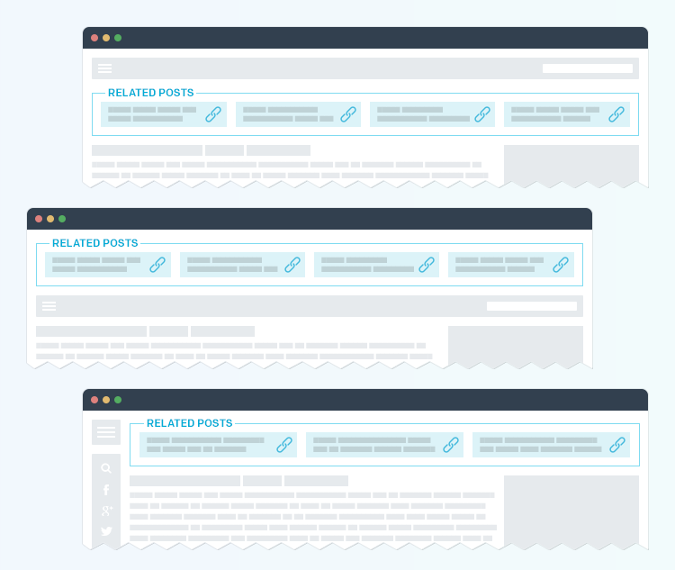
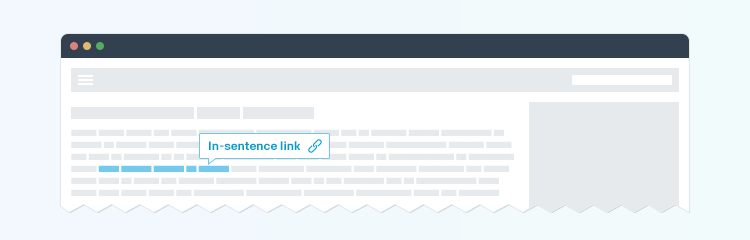
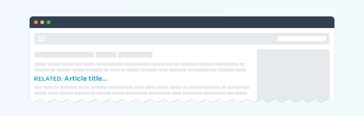
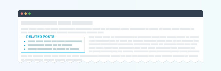
In the Body of the Article
The article itself may provide context for a link to other content on your website. An essential idea to keep in mind is striving for maximum relevance. There are three efficient ways of placing links within the article text:
1. In-sentence links with an anchor on keywords (just like the link in the paragraph above):
2. An anchor breaking the parts of the article – in other words, the link is placed separately between the paragraphs. A widely-used pattern is "Related: [Article title]".
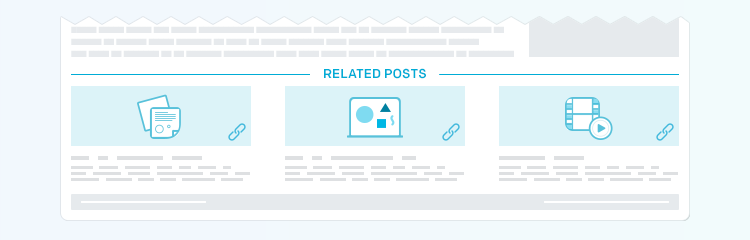
3. A "Related" or "Recent Articles" section with several headlines. This type of unit is typically aligned to the left and wrapped with text.
Below the Article Content
Placing links under the article is a popular approach with a large variety of styling patterns to choose from. The links typically go with thumbnail images and headlines. If multiple authors write articles for your site, mentioning their names would be a good idea. An important detail is refraining from obtrusive design and abnormally large pictures.
An alternative (or additional) option is using tags that lead your readers to multiple articles on the same topic.
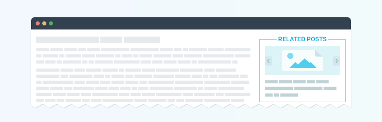
Sidebars
There is a good reason for publishers to arrange their links into sidebars. The thing is, the size of these elements is often similar to that of ad units, which makes advertisements go well with the overall design of the website. In particular, this works well for miniature slideshows with thumbnail images and article titles.
Other configurations include lists of article headlines, as well as various preview combinations of images and titles. Two differently-styled sidebars (e.g. "Most-Viewed" and "Recommended Articles") can be helpful for multicolumn page layouts.
Composition and Layout
The design and placement patterns above have proven to be effective for some of the top publishers in the world. Still, it is recommended that you test these examples to see, which ones are better suited for your website. Conducting A/B or multivariate (MVT) tests will help you choose the optimal layout. In order to see what pattern is right for your site and its audience, you need to experiment with a number of elements:
- The quantity of previews per block: as a rule, from one to three links to related posts are shown in one block, but the number can actually be as high as six or even exceed this figure.
- The type of content shown in the preview: typically, article titles are combined with pictures, but in some cases images are excluded from the previews. Additionally, the author's name, short description and latest comments can be used.
- Block types: static previews, sliders and slideshows are considered popular, but scrollable blocks, arrows, and pop-ups are also worth trying out. Different design elements (like slider controls) may have certain influence on the readers.
- Block size: a common approach is to start with 300*250 format before switching to other variants.
Algorithms
Article selection is another important detail that requires testing. Publishers typically make use of various algorithms:
- Primitive automatic: the articles are chosen at random from the same section or from the whole website.
- Smart automatic: the articles are arranged into groups (e.g. "Most Popular", "Most Commented", "Most Shared", etc.) based on the analysis of target audience behavior. Outbrain and Taboola are among the companies that provide this service.
- Semi automatic: the article selection is based on relevance, which makes the similar service providers use SEO methods to produce this effect. suggested items look like they were picked manually by a human. HubSpot and similar service providers use SEO methods to produce this effect.
- Manual or smart semi automatic: the suggested articles are selected internally from the site as well as from other web resources based on their relevance to the topic.