
Best menu designs to improve your website's UX
How do you make a menu that drives the readers to explore your website? In search of the answer to that question, one should definitely start with usability and responsive design. Of course, choosing what's right for your website and readers is no easy matter, so A/B testing will most probably come in handy. Looking at the way world-famous media companies treat their menus will definitely be useful for news website owners.
Horizontal Two-Level Menus
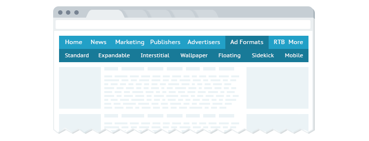
This clean and simple option is utilized by US News. It is based on a two-level horizontal layout where the bottom level is reserved for submenus. Keeping the second level visible is considered good practice: this way the readers will be able to easily find their way through the site. In fact, this approach determines one of the main advantages of the horizontal layout over drop-downs – straightforward navigation accounts for better user experience. Menu items are generally highlighted (e.g. underlined) on hover.
Note that on mobile devices some elements tend to "fall out" due to smaller display size. In certain cases the items to the right remain off screen and users have to drag the page in order to see them. Thus, proper arrangement is crucial for publishers who choose this option.
Mobile-Friendly Collapsed Menus
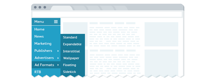
A trendy approach is to use collapsed menus with vertically-aligned elements. The Washington Post and The New York Times are among the most famous proponents of this strategy. The menu slides from left to right or drops down when triggered by a button. A minimalist icon with three horizontal lines is promoted as a common marking for this UI element, but on desktop-sized screens it can be accompanied with text: "menu", "sections", "more", etc. Second-level items and lists are usually shown on mouse hover or tap.
Page content animation is another essential point. Some webmasters choose to superimpose the unfolded menus over the main content. Another option is shifting the content to the side when the menu is activated. When displayed on a tablet or smartphone screen, the menu may incorporate the search and log-in buttons, which are typically positioned separately in desktop mode.
Full-Sized on Big Screens, Collapsed on Mobile

A popular mobile-optimized strategy is to use a full-sized menu on big screens and to replace it with a collapsed version on gadgets. Thus, the site visitors get a better overview of menu items and subitems, which enhances the usability. When switching to mobile, the horizontal layout is substituted with a space-saving button. This approach was successfully implemented by The Telegraph, among other media companies.
previous post next post